I’ve been working on a new color palette I’m now calling “Autumn Splendor” (thanks to Vickie who suggested the splendor). I tweaked the gold a bit, and the five colors now work really well as a multicolor combination:
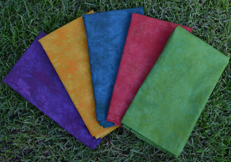
Putting together a group of colors that work together as single colors is a bit harder…I can’t decide whether I like just these 5 alone:
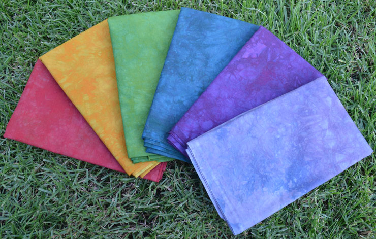
or this purpley-grey?
I’m going to have to stare these pix for awhile and see how I feel! Then, at some point, I’m going to have to actually start working with these!


14 Responses
the purple grey adds sparkle! fab work you have done…love the gradations…
Thanks! I wish that light grey purple felt more “Autumn” to me, because it is quite a sparkler!
I really like the one under the “should I add a brown?” (Autumn Splendor-6,18). I do think the 6th color really adds something to the group. Love your colors!
Thanks Jill, I’m thinking that’s where I’m going!
It is a beautiful palette and I do like the addition of the lighter value.
Thanks Vickie! I’m gonna have to just start cutting…LOL!
For some reason, the green pops out of the stack of individual colors and I want to change it. It is so blended in the multicolor pieces that you don’t see it there, but on it’s own it seems more like spring/summer than Autumn Splendor on my screen. (Maybe in real life, the color is perfect.)
Ah…but when I work with these colors in art I’m going to WANT some contrast! That’s why I’m still fussing a bit with the single colors…I LOVE LOVE LOVE how the multicolor looks!
The Autumn Splendor is gorgeous! Looks great with all, but I think I’d go with the brown.
Thanks Susan! That’s how I’m leaning right now!
Very beautiful! I like it with the brown best- feels more like autumn.
Thanks Shawn! That’s how I’m leaning right now!
“Autumn Splendor” is splendid. Gorgeous!
I’m not sure about the brown; I like the five and I like the addition of the purple-grey. Just my opinion — it will be interesting to see what you end up with!
Your fall colours are awesome.