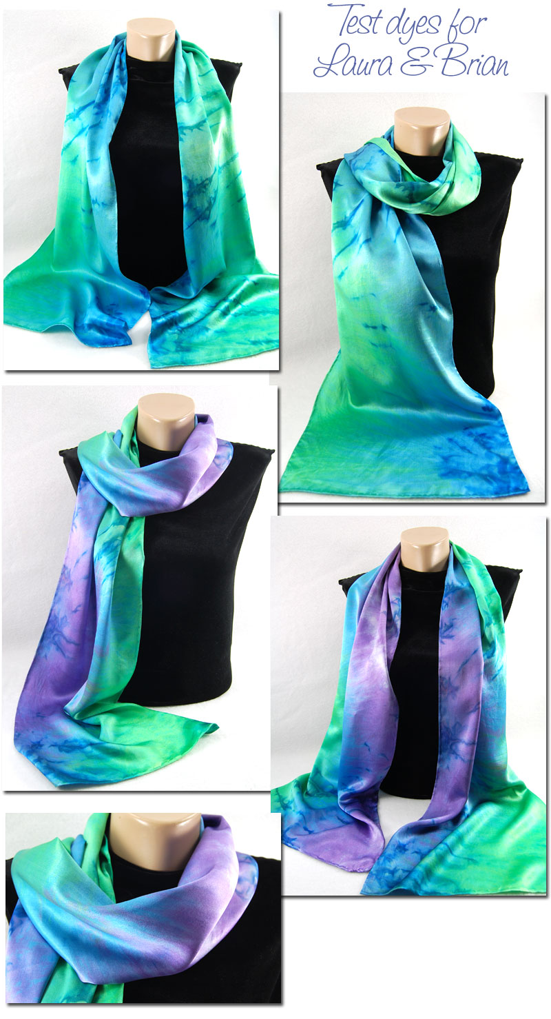
 In August I dyed two scarves for a couple that is getting married next Spring. They’d like the entire wedding party to wear something (a stole, tie, scarf or pocket square) dyed with the same palette, and then each person can just wear clothes that go with scarf – how cool is that? I’m also going to dye some silk that the groom is going to have a vest made from – double cool!
Anyway, to the left is the result of that first round.
I thought I’d share what I did next!
I got this email a few days later:
We discussed the scarves the other night, and we really like the Wisteria-plus-green (the scarf that is blue + green + purple, the bottom 3 pictures here). There are some (relatively minor) changes that we’d be interested in seeing:
Is it possible to make the blue region in the center wider? It seems as though it gets crowded out by the purple and the green.
We both like the “sunrise” effect that comes from the serpentine crumpling, but we’re also both fond of the vertical striping (i.e., where the three colors come down the length of the scarf in long, broad bands). We were wondering if it would be able to compromise between the two– a design where the serpentine curves stay closer to the center of the bolt of fabric.
Laura is wanting to move somewhat away from the details that say “tie-dyed”. She felt that the dark streaks produced by dying the silk in the heat draw the eye too much, so she’d prefer to eliminate them. There are also a few places where the dye didn’t get all the way into the cloth, leaving the white showing through. We both really like the rich colors, so we’d prefer not to leave any white areas.
Finally, I think we’d both be interested in seeing the design with a richer, less yellow shade of green.
As I read back over this e-mail, it looks like a list of complaints, which wasn’t my intention! We’re really pleased with the results so far!
I first dyed some test swatches to try to get a less yellow shade of green, but still not at all dulled. I wish I’d take a picture of those swatches, but I didn’t. They really liked the green that was 1 part yellow to 2 parts turquoise (the original geen was 2:8).
Then, to up the blue, I used 50% blue, 25% green and 25% purple, rather than the 33% of each I used with the first scarf.
To decrease the dark streaks that happens with my Cerulean Blue when it sits in the hot California sun, I brought the dyeing scarf inside and it batched under my dining room table!
Here is the result:
They like it – hooray! Now, to get everything dyed before mid-December; one of their bridal party is travelling to India and is going to purchase clothing there, so it would be nice if she had her scarf! 🙂


8 Responses
Wow – fantastic Candy, who couldn’t love them…
The colours are stunning.
gorgeous! You are a good listener – I think you hit their mark! Beautiful.
GORGEOUS – this will be a beautiful wedding – make sure they send you a pic or two!
Absolutely stunning colors! Do you think you could do a Pashmini scarf using those colors?
Thanks! Most Pashminas have cashmere in them, and my process doesn’t work with wool (and other protein fibers), only silk and cotton (or other cellulose based fibers). SO, no I couldn’t easily do that! Wool is a whole different world! 🙂
I love these are you still or can you still make this scarf?
I sure can!