A couple of months ago, a new Procion MX dye was released that’s actually a pure grey – one single molecule is responsible for the color, rather than the mixtures that all grey and black Procion MX dyes have been up to this point. I finally got around to ordering some from ProChem and dyeing some different concentrations of it because I need a lot of different greys for my Scrappy Swiss Cross Quilt. When I dye greys using Nickel, my favorite dye mix when it comes to making greys, I really like the light tones in the 0.1 – 0.6% OWD/DOS range, so I decided to dye several tones of the new Neutral Grey in that range, and then going 1 lighter and a couple darker.
When prepping my dye solution, the first thing I noticed was that there’s some white filler mixed in with the Neutral Grey powder, because there were lots of white specks mixed in with the grey specks. I understand why they did this, because greys are lighter values, and it would be easy to dye something too dark if you didn’t weigh your powders and measure carefully; this is why I usually use pure dyes, I don’t pay the dyehouse for filler, I just use less dye when I want to have light values of fabric. Anyway, here’s what I got:
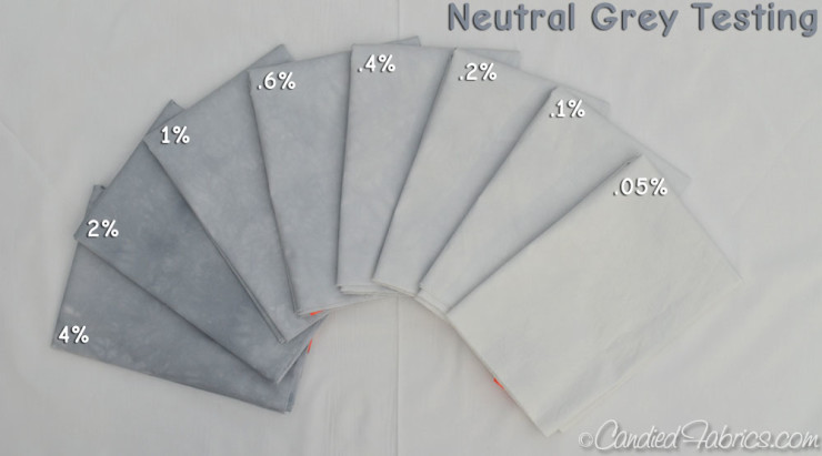

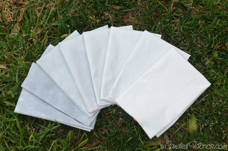
It’s a very nice hue, and although their is some visual texture because I dye using low water immersion, which emphasizes that, there’s no splitting, no other hues that come through, as I have when I use Nickel, or any of the blacks:

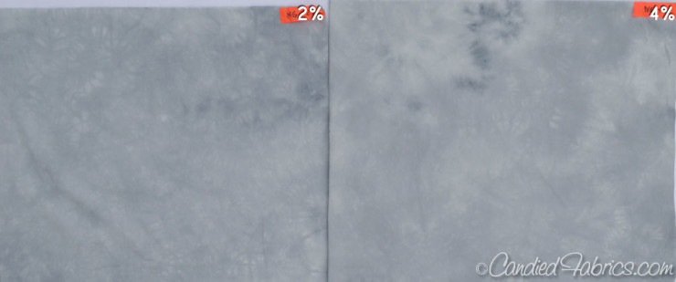
I was VERY surprised to see how light all the values are! The 0.05% grey is very very close to white, I had to put a piece of the base cloth I used (testfabrics 419) next to it to see any difference. I’m not used to something dyed at a DOS of 4% to be so close in value to the 1% version of the same hue.
Here’s pieces of Nickel dyed at the same DOS, you can see how much more intense the Nickel is at matching DOS:
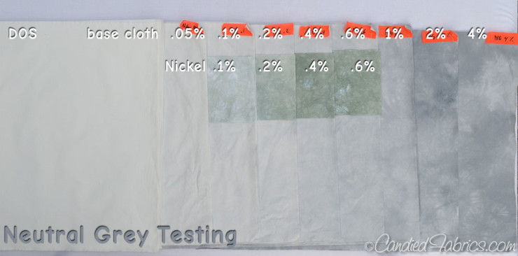
I moved the pieces of nickel to what I thought were the closest intensities:
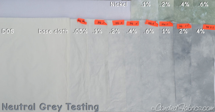
But I think the 0.6% DOS of Nickel is more intense than the 4% Neutral Grey – do you?
I was so freaked out by this that I was worried I didn’t batch at a warm enough temperature (because I dyed these late on a cool day and didn’t batch overnight because I want light values), so I’ve designed another experiment to confirm this.
So, here’s the thing. I’ve been looking at these fabrics for a couple of days in lots of different light. As you can see in all the pictures in this post, it’s hard to photograph these fabrics, even with the white balance set, but I do believe what I’m showing you is what I see, and sometimes when I look at these fabrics, the neutral grey looks purple-ish. Nickel really does have a greenish tinge to it, but I was a bit surprised to see purple with this neutral grey. It seems to be more severe at the 1-4% DOS range, so maybe if I stay in the low values I won’t see the purple. I’m still ruminating on this.
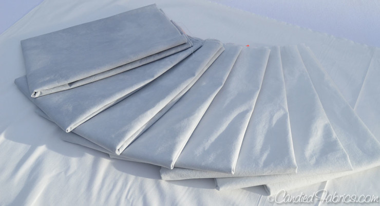
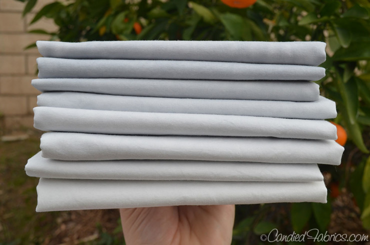
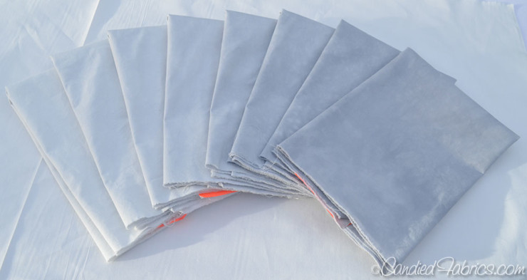
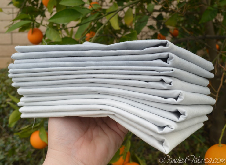
In the meantime, more pretty pictures of fabric, just because!

9 Responses
Thanks for the comparison and review. I am surprised at how light the greys are. It would be interesting to see how dark you can go. Love all the gradations.
Stay tuned! Pix are in my camera!!!
Nice to know there is another pure dye out there. I order from Dharma, I wonder if they have it available? And thanks for sharing your experiments. I don’t really see a purple tinge (I really see a green with the Nickel), but then you are up close and personal living with the fabrics so you’ll know the colour much better.
Dharma has told several dyers that they plan to be selling it – I’ll bet when they do it’ll be in their newsletter, so make sure you’re subscribed and you’ll find out when we all do! 🙂
Glad to hear you don’t see purple – I have no idea how much of the purple is just in my brain! 😉
It’s a really nice gray but I’m very surprised at how light it is.
ME TOO!!! Wait til you see the next batch, there’s not much more depth at a DOS of 8. Now, when it warms up I’ll do a repeat of this in my hot backyard, but I did several rounds of careful microwaving for the second batch so I don’t believe that more heat will end up creating darker tones.
Great to see your test of this gray. Can’t wait to see the darker ones. Thanks.
I do like the hue of this grey better — don’t care much for the greenish tones in the other. I don’t see purple, but it may be because it is next to the nickel. I’d complain to ProChem about the filler — I suspect that is part of the problem with intensity, but it may also reflect the limits of the single molecule dye. When you dye greys with a very diluted “warm” or “neutral” or “cool” black, what do you get? Don’t remember this, but also don’t know if you’ve even done this. Also, what happens if you double or triple dye the fabrics at the same level of dye concentration. I have no experience with this, but I remember reading that Nancy Crow claimed that was the secret to the intensity of her colors. Can’t remember which of her books it was — I think I have them all. Might be worth an experiment with a single one of the dark tones, just to compare it with what you have.
I’m glad to hear that you see purple in the new pure gray, because the same thing happened to me! I am dyeing a lot of different grays for a current project, wanting, like you, to use a number of different hues in one project. (Some I’m mixing from primaries, some from pre-mixed blacks; I haven’t tried Nickel.) When I put large squares of the different grays up on my design wall, the pure gray really sticks out–doesn’t play at all well with the others. I think it’s a lovely color on its own, but I might not be able to use it in this project. I’ll probably do a blog post later this week when I wash out more of the samples I’ve been working on.