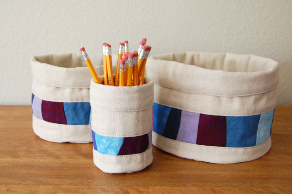
Cyn of Riverdog Prints has a meetup called “Collecting Color” that’s all about…you guessed it, color! Last week, I made a set of nesting baskets in some custom colors my client had selected earlier in the summer. When I was working on the pieced strip for the basket, I was worried about the colors. The light lavender and blues kind of had a “baby” feel:
But after seeing that I had plenty of variety in value, I decided to push on.
Once I finished the baskets, I was really happy with the color:
 Why? What made the difference?
I think it’s because of the brown undertones in osnaburg that I used as the main fabric. Brown/beige has an orange undertone, and I think this helped tone down blues, because orange is the complement of blue.
I don’t know if that’s the reason…but, I know the osnaburg took these colors from sweet to sophisticated!


4 Responses
I love this color combo. Clean, fresh and yep, sophisticated. Home run, Candy!
The colors look great Candy! These baskets are fabulous too.
Whatever the reason, they worked beautifully and certainly don’t look “babyish”.
The nesting baskets are great. I love how you processed the colors via contrast. That is really helpful.